
This book shows and tells why some are getting or designing the good stuff while the others are only getting mediocrity.
The Culture of Design by Vladislav Golovach
Translated by John Sowerby
ISBN 978-5-950085-4-1-3
Design Culture is an account of what lies behind the design of anything, from a chair to a website. It examines the many aspects of culture that shaped design in the past, still shape it today and will go on shaping it in the future. The book is intended for designers and their clients, and indeed for anyone who uses design and buys objects and services.
This is a special book about design. Instead of talking breathlessly about designers, going into raptures over individual styles or artefacts, or focusing on particular fields of design (that are only interesting to people who work in them), the book talks about design overall, how it comes about and what important preconditions it needs.
Design Culture contains many illustrations, and its witty and sardonic style helps to make the many and varied causes that underlie design easier to understand.

Readers have given this book 4,5 stars on Goodreads. It's more than War and Peace, Crime and Punishment and The Three Sisters by Anton Chekhov have obtained.
Sans water. This is a compact book. You can read it in one evening yet it will take much more time to digest.
Facts, Facts, Facts. Every trend covered is illustrated with at least one case and usually more.
Easy complexity. The field of design is ginormous, yet the trends are simple enough (if you know them).
Pleasant to read. The book itself is carefully crafted for Kindle. Read everywhere, on any device you own.
All of us are a connected with design. Even if we not designers themselves, we do buy and consume products of design. To do that well takes a culture and this book is precisely about that culture, the Culture of Design.
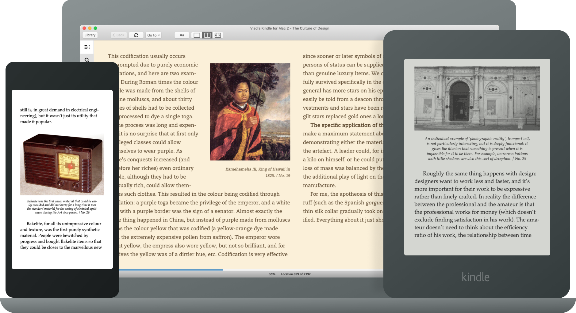
Demo chapter
Class appears in European haute (put simply: expensive) cuisine just as much as in other types of design. (When it comes to creating new recipes or perfecting old ones, the culinary arts are also essentially design, and Food Design is taught as a subject in Faculties of Design.)
One reason why expensive ingredients were valued is because they were expensive. For example, in the Middle Ages much more spice was put into food than nowadays. As soon as spices got cheaper this tradition died a peaceful death. (It wasn’t due just to the reduced value, of course: food with too much pepper or which was horribly spiced was thought to activate what were called humours, even if not all of them.)
Costly technological processes were also valued. If peasants ever ate meat, for instance, it was always either boiled or stewed. The masters only ate meat that had been roasted on a spit over an open fire, since this type of cooking needed much more firewood and much more effort (special servants had to keep turning and adjusting the spit according to the state of the fire).
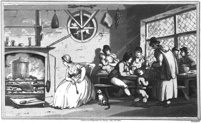
Dog turning a spit*.
This method was obviously preferable if you wanted to demonstrate the expensiveness of your food (and to bring on humours, as people believed that boiled meat delayed humours). Demand among the upper classes was consequently high, and dogs that were small, hardy and incurably optimistic were specially bred to turn spits. But as soon as motors appeared that could turn spits (clockwork at first, and then electric) and there were reliable energy sources (gas or electricity), meat roasted on a spit quickly lost its demonstrative component. Nowadays anyone who has tasted doner meat or grilled chicken can appreciate this loss.
But the conspicuous consumption of roasted meat took a long time to die out (even as early as the Middle Ages people had tried to think up any sort of motor for turning a spit). It’s much more interesting when something collapses suddenly. Cooking gives another good example for this: chopping and puréeing the ingredients. Enter the quenelle. Quenelles are basically meat balls, but not made from coarse mince; instead the ingredients (meat or fish) have to be puréed.
Making quenelles the traditional way is quite a task. First of all the meat or fish has to be chopped very finely, and must then be ground in a mortar for a long time until the fibres are completely broken down. Using a mincer is no quicker, since the mince has to be put through it several times, and even then the result isn’t convincing: you’ll be able to feel pieces of food on your tongue, and the whole delight of quenelles will be lost. The only way is grinding in a mortar.
It’s no surprise that haute cuisine loved quenelles, just as it loved any dish that required a very large amount of manual work (such as Nesselrode Pudding, which took several hours to prepare).
Then the day came when everything changed. In 1963 the Frenchman Pierre Verdon invented the first food processor. It was initially sold under the name Robot Coupe and was intended for the catering industry. Then Verdon realised that it could be sold to ordinary people, and a compact version called Magimix appeared in 1971.
The machine was spotted quite quickly by Carl Sontheimer, an American. As a successful engineer he was intending to set up a new company and was searching for ideas for his business. Having seen the Robot Coupe at an industrial exhibition he took out a licence to manufacture it, and after making some refinements to its construction he launched the Cuisinart food processor on the American market in 1973.
The processor was phenomenally successful, even when you took into account its high cost (it sold initially for $160, which is the equivalent of around $800 dollars today). It only needed a couple of glowing reviews (in Gourmet and New York Times) to set off a mania for eating food that had been turned into paste. Many processors appeared that were similar to the Cuisinart. A lot of books were written with recipes for food processors (but that was not until the 1980s, when processors became cheaper and anyone could buy one).
This orgy of finely-ground food lasted until the mid-1990s, and then the usual thing happened: people had had enough of homogenised food. They had had enough to such an extent that food processors are now only mentioned in just a few suitable recipes on epicurious.com. Owning a food processor has lost any connotation of top-quality food, and it’s now associated with petit bourgeois vulgarity.
Of course, it’s not because a food processor is bad (it’s a useful thing, and certainly plenty of dishes are difficult to make without one), and it’s not because homogenised dishes are bad (anyone who has tasted good quenelles will never forget them). It’s simply that when a utensil has been over-abundant for a long time, our attitude towards it deteriorates, and it gets to the point where we forget about it. (After all, homogenised food has recently made a comeback in a new guise, and it’s now called a smoothie.)
It’s simply a pendulum. As soon as something becomes possible, it becomes fresh, fashionable and relevant; then, inexorably, it becomes boring, tired and vulgar. That’s when the pendulum effect starts: the original thing becomes relevant again, and with roughly the same periodicity, although there will be a slight damping. The first strong impulse is followed by a strong reverse impulse (we can see an example of that in the food processors). Then with each swing of the pendulum the gap between hatred and love grows smaller and the overall effect becomes less pronounced. We can only see the pendulum’s effect clearly if the initial impulse was very strong or if it happened a long time ago. In any case, sooner or later pendulum stops swinging.
You’ll find pendulums like this everywhere where something has existed for a long time. Up-to-the-minute colours in fashion are a brilliant example. They come round in circles, with just slight variations, apart from the enduring black. Admittedly there are three pendulums operating simultaneously when it comes to colours for clothes: light versus dark, vivid versus subdued and the colour wheel itself. The existence of these three pendulums all at the same time makes forecasting the next season’s colours quite a difficult business. This is especially so because the initial impulse (the appearance of cheap, bright aniline dyes) happened back at the end of the 19th century, and has almost come to a stop now.
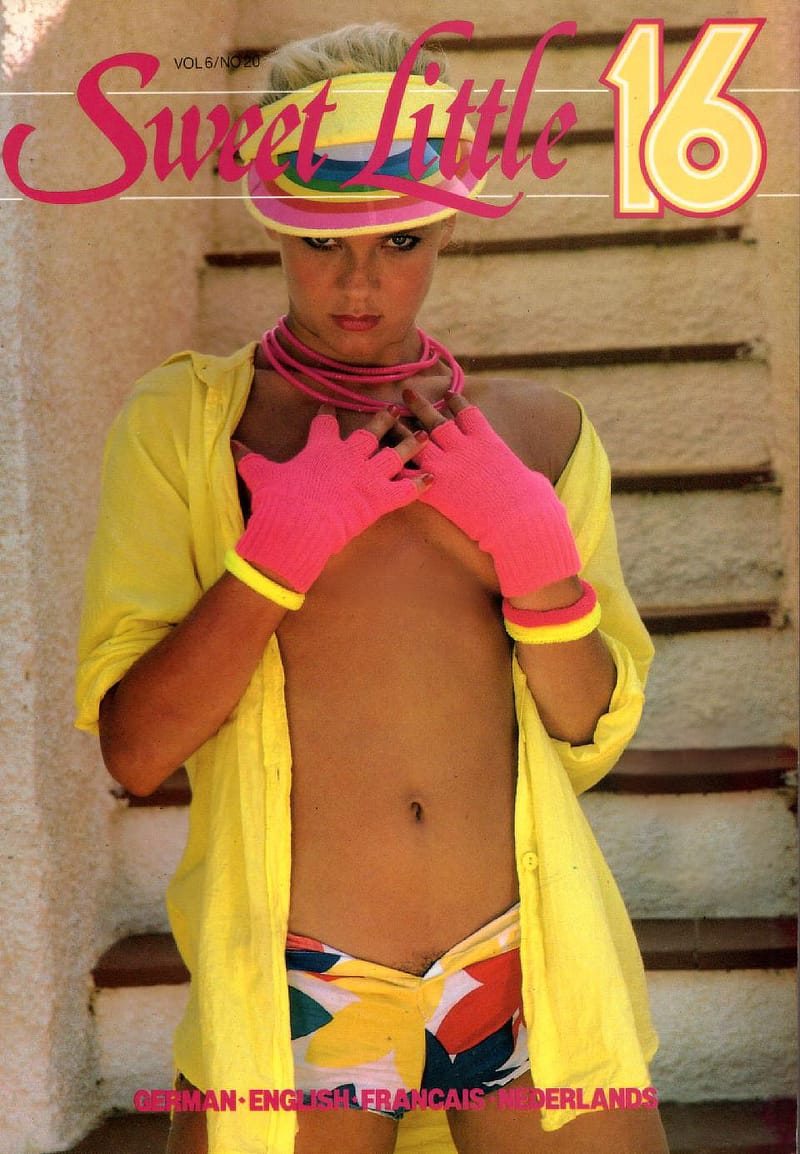
It was only in the 1980s that a self-respecting girl could appear in a hat like that and such brightly-coloured and skimpy clothing. Also, pendulum theory tells us that bushes down below, completely obliterated for now, will make a triumphal comeback**.
Sometimes the three separate pendulums are in phase for a time; when this happens there are developments that cannot be explained any other way, such as the 1970s Age of a Plethora of Brown, or (with the pendulums still in phase) the 1980s Eye-popping Colour Combinations. Luckily or unluckily, since then clothing producers (especially the Zara company) have thought up high-speed fashion, in which it’s not every few years that everything changes, but every season. Thanks to this very rapid fashion there won’t be any more of these long periods.
Here are another two pendulums, and you will be able to find many others by yourself.
The iMac with its semi-transparent polycarbonate casing appeared in 1998, and proved to be very popular. Other mass-produced products with semi-transparent bodies began to appear almost immediately. For example, in 2002 Philippe Starck designed the Louis Ghost Chair that became fantastically popular. It was an ordinary Neoclassical chair, although with a greatly simplified form, but it was made from transparent polycarbonate. This impulse soon made its way to Chinese imitators, and large objects made out of transparent plastic promptly went out of fashion (but, just like many of Kartell’s products, this hasn’t stopped the transparent chair from selling). However, we can be sure that the anti-impulse will soon lose its power and semi-transparent objects will make a sudden comeback (they’ve already started to): the initial impulse only happened quite recently, so the pendulum still has a long time to run.
Knowing Philippe Starck’s ability to sense which way the wind is blowing, we can be quite confident that as soon as he issues a large new transparent product the pendulum will start a new cycle.
Here’s another pendulum. Data-carrying compact discs appeared in the mid-1990s. Compared to floppy disks, they could store a mind-blowing amount of information: a total of 600 megabytes. Although the computers of the time were limited – 256 colours and a 14” screen were the norm – the interfaces for software immediately became sumptuous (at that point it was mainly games and interactive encyclopaedias). There was a sudden burst of previously unimaginable riches such as textured interfaces (Stone! Textured linen paper! Gradients!), pre-drawn buttons (with icons!) and splash screens (animated!). Those decorations didn’t fit on a floppy disc, but they did fit on a CD. But this very quickly palled on people, and it palled on people so much that the market for interactive encyclopaedias and books simply vanished: even the most loyal customers got tired of buying these riches.
Interfaces became simple and unpretentious. For example, Microsoft Encarta, the most successful interactive encyclopaedia of the time, was updated every couple of years and received a new and up-to-date interface each time. At the start of the process, between 1993 and 1996, the new versions delighted their users each year with shading, rounded corners, virulent colours and icons on literally every single button. By 1997 it was finally clear that this didn’t work, and that year’s version came out with a pastel colour range and a minimum of decoration. There was even less ‘beauty’ in the 1999 version, and the interface had even turned black. The pendulum had begun to swing back.
However, the pendulum carried on swinging, and Encarta’s interface very quickly began getting richer again. Encarta 2004, for example, didn’t get an abundance of rounded corners, and there were hardly any extra icons, but the bright colours and gradients were back. Each new version of the encyclopedia was still brighter and more sumptuous. We don’t know what great heights it would have achieved, but by 2009 the Internet had finally killed off distribution by CD. Encarta breathed its last, and no gradients or rounded corners could save it.
You can follow this evolution for yourself. There aren’t many screenshots on the Internet, but there is quite a good number of videos (just enter ‘Encarta’ on YouTube). I recommend looking in particular at Encarta 1999; it was an amazing product for its time, and Microsoft’s designers invented responsive design specially for it.
The pendulum carried on swinging backwards and forwards. The MacOS X with textured user interface and realistic icons saw the light of day in 2002. Computers had become so powerful that this sort of interface was now feasible as it hardly used up any processor resources. The iPhone, with its even richer interface, appeared in 2007. However, everything that begins must also end. The pendulum swung back again quite recently, and screen designers throughout the world retrained themselves for ‘flat design’: some were delighted, and others were in anguish.
I recommend that you investigate for yourself the analogous pendulum in web design (as far as I remember there was one cycle more than with other interfaces; the extra cycle was due to the wonderful Macromedia Flash technology which allowed you to produce marvellous things like transparency and even animated interfaces).
‘Flat design’ isn’t good in interfaces because it’s flat, or because it’s good: it’s good because the design of interfaces had been non-flat for too long. When enough time has passed flat design will stop being good. Instead of thinking about which type of design is good, it’s much more productive in this respect to think about what type of design is good now, and will be for at least another couple of years. It seems that that is all that Philippe Starck thinks about, and his results are better than many peoples’ – there’s something to be learnt there.
Moreover it’s very useful, from the practical point of view, to keep an eye on both what is up to date and also what hasn’t been up to date for quite some time. It’s more than likely that the latter will come back into fashion, and the person who guesses when will benefit greatly from it. This is the real benefit of watching a pendulum, i.e. aberrations of style due simply to time.
* Kitchen in Newcastle-upon-Tyne. Illustration from Remarks on a Tour to North and South Wales in the Year 1797. Slightly cleaned scans from Google Books. Public domain.
** Cover of ‘Sweet Little 16’ magazine, 1986. From the author's collection.
In addition to this material world, we also live in a world of protocols that people have created – fashions, conventions, and social habits and mores – and a collision with this world, especially at high speed, is often just as painful as a collision with the material world. — Introduction
The first aspect of culture, the cultural background, is close to the popular idea of culture. It is ‘something majestic and beautiful from the past that every cultured person should know, whether it is the creations of the composer Berlioz, the artist Ingres, the writer Chekhov or of a couple, Charles and Ray Eames’. This culture forms our template for good design. — Two cultures
At any particular moment of time there is a genuine sum of culture that is acting upon us, and the current state of design is part of that sum. Paying no attention to earlier achievements of culture, and therefore of this sum, always indicates our ignorance of it. — The culture of design
The customer and his expectations are an important aspect of design and art. Since the end of the 19th century the usual thing in art has been to rub the customer up the wrong way (épater la bourgeoisie!), whereas in design it is the opposite, but in both cases it’s done affectionately. — Aim, capabilities, message, style
The Russian gopnik contains at least two programs: ‘Russian’ and ‘Gopnik’. The in-built ‘Russian’ (or more accurately ‘Eastern Slav’) program tells him that he can and must squat on his heels, while the ‘Gopnik’ program requires him to wear Adidas clothes, and the darker, the better. — Design culture
Creative solutions are always difficult, since if they weren’t difficult they wouldn’t be creative. Designers are just as likely as anyone else to economise on intellectual effort and soul-searching. But it is specifically creative solutions that make up real design: everything else in a designer’s work is decoration, and that is subject to inflation. — The inflation of our work
There has been a lot of talk recently about artefacts being available to the very poor (a euphemism is ‘people of the developing countries’), to people with physical limitations (people with physical defects such as blindness, and also the elderly) and to people who are not very good at thinking (children and the simple-minded). This is good, and it’s important: after all, there’s every chance that we will start to grow old, that we will grow feeble or become poor, and functionally a simpleton is no different from a person in a hurry who simply doesn’t have time to think. — The others
In addition to these themes there is, of course, the artefact’s emotional message, which also forms part of culture (thus at one time joie de vivre dominated over terribilità, whereas frustration is in vogue nowadays). — From techne to message
The chemist Carl Wilhelm Scheele discovered chlorine in 1774, and in 1785 another chemist, Claude Louis Berthollet, developed a method for bleaching cloth using chlorine. Cloth had previously been bleached mainly by using either sunlight (time-consuming, expensive, and impractical in northern countries) or ammonia from stale urine (quick but expensive). With the discovery of chlorine cloth could be made truly white for the first time. — Две культуры
It’s very easy to automate small-scale embroidery in clothing, and even more so for printed images, but large-scale embroidery is very difficult. Because of this, large-scale embroidery, which was a mass feature of clothing until the 1920s, when the labour was cheap, has now almost completely vanished from the clothing of the lower and middle classes (it’s uneconomic). In its turn, since printed images and small-scale embroidery, even very intricate, are embarrassingly cheap, they have become a reliable indicator of clothes for the working class. — Design for excess
It’s important to realise that the teachers at Bauhaus had nothing against the old form of design, Design for excess. As a minimum, they made their students study it carefully, and Gropius and van der Velde happily sat on anti-proletarian carved chairs (van der Velde even worked in this style). However, they didn’t want to work for the rich, but for the poor. — Design for accessibility
Until the start of the 1960s almost all printed advertising was based on hand-drawn originals, but afterwards it was almost exclusively photographic. Had there been a change in the consumers’ aesthetic preferences? Or was it because new technologies for colour separation and printing made it possible to print photographs that were better in quality and cheaper than art work? — Design for improvement
issued in 1948, and polypropylene appeared in 1954.Consequently we now live in a world in which it’s almost impossible to imagine what it would be like without any plastics at all. I suggest that you straightaway have a good look and count how many plastic objects there are around you (or at least with parts made of plastic). — A material from the future
Bystanders can happily let their imagination run riot in thinking of design as a flight of the mind, where the designer literally flits about and keeps on and on creating. Everything is wrong about this idea. — Craftsmanship vs. originality
Mechanisation has changed our ideas about how well materials are finished. Machines do many, if not most, technical operations more neatly and accurately than a person can; often now it’s an object’s imperfection, and not its formal quality, that indicates high-quality and expensive production. The result of this is that something expensive can be recognised by both a very high and a very low quality of finish at one and the same time. — The evolution of coarseness
These two superstyles are Art Nouveau and Art Deco. Artefacts in these styles look totally different; the derivatives of these styles, along with their own subsequent offshoots, also look different. But when they appeared – even though they looked utterly different – they were a single style with a single line of development. — Technological determinism
Even if crack hadn’t been up to the job, AIDS would certainly have succeeded. In 1983 Klaus Nomi was the first well known kulturträger to die from it. This was followed by a flood of deaths from the new disease (which was soon called the ‘twentieth century plague’). People involved in culture began dropping like flies, and it would no doubt soon be the turn of the ordinary people. — Modernism and Postmodernism
Living with elegant artefacts put its mark on the Western mentality. A clear convention that everyone acknowledged was established in retail: the more goods there are in a shop window, the cheaper is the shop (there’s even a whole concept – horror vacui, fear of emptiness – that can be seen in a way of life that is full of objects and decoration).. — From opulence to elegance
The situation was even worse with high-rise buildings, where Modernism unwittingly did the one thing that it dreaded. Skyscrapers built up until the mid-1930s did at least have something that we can call finish. There was plenty of it before Art Deco (the Met Life Tower) and much less during Art Deco (the Empire State Building). With the triumph of Modernism all skyscrapers built from the 1960s on began to look completely identical: elongated boxes with every side covered with glass (like the late-lamented World Trade Center). — Design in red
The Irish Pub Company, together with Guinness, has been selling instant ‘Irish’ pubs for over thirty years; these are containers with everything that could be needed to decorate a pub. The package contains absolutely everything, from tankards to reproductions of posters on walls... ...Unfortunately, until recently Ireland was famous for its unbelievable poverty, and the real traditional Irish pub was a room full of tobacco smoke and spittle, where only one type of beer was sold and the only snack was boiled tripe. — Non-traditional traditional quality
I am sure that many of Mid-century Modern’s apologists would be happy, for instance, to paint their designs gold, and give their furniture cabriole legs, and even with hooves; and if they had done this they would have found their clientele. But how many of them would understand their wish? — Conclusion
My name is Vlad Golovach and I do design since the last millennium. From book and instructional design I went to user interfaces and for 15 years was the lead designer and art director in the first ever UI design studio in Russia.
The Culture of Design is my third book. Before that I wrote couple of others (in Russian, on UI design). Also, now and then I write articles on design and culture on Medium.
Additional info — Facebook or LinkedIn. Or my studio's site, Kulturvolk.